One crucial part of your website is your navigation or website menu. For many people the navigation is an after thought, just tossing links in place. It’s important that we take time and plan out the website menu to avoid confusion and assist site users in getting where they need to be.
Your website menu is either going to turn your website visitor into a customer or it’s going to turn them away. Here are some steps to keep your visitor happy and on your website.
Important links only
Limit your website menu to important links only. It should never list every page on your website. The important top level links include Services/Products, About, Blog, Contact and possibly a Home link. You might add one or two more, but make sure to not over do it. Neil Patel recommends we follow the KISS method when creating our website menu.

Secondary links
Secondary links include individual product or service pages. These links can placed as drop downs under your main menu links or put into a footer menu. An on page or side menu works as well.
Avoid mega menus
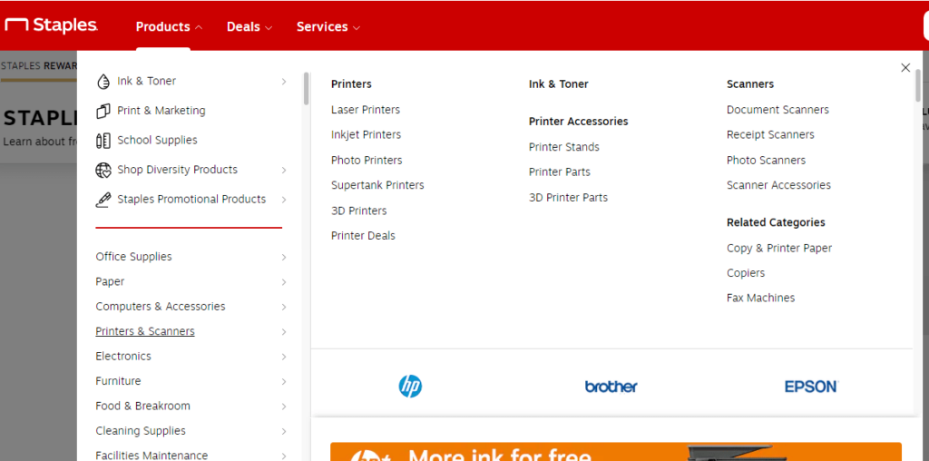
I’m sure you’ve seen those massive menus that span the entire page and list every page of a website. These types of menus should be avoided unless they’re being used in a smart way. Links in a mega menu need to be categorized and clearly defined. Staples does a great job of this.

Keep screen sizes in mind
Make sure your menu translates well to tablet and mobile. In most cases you’ll want to switch to a hamburger menu on mobile and possibly tablet. You’ll want to make sure your menu works well in that layout as well, you don’t want to change it between to the various screen formats.
Fonts matter
Make sure you are using clear, legible fonts for your menu. This is not the place for fancy, scripty fonts. While they look pretty, your menu needs to be clear and easy to read. Save the pretty fonts for other areas of your webpage.
Keeping these things in mind will help your website visitor navigate your website easier, turning them into a paying customer. The goal of your website is a transaction and you won’t have that if your visitor can’t get to the buy button! Make it easy and make the sale.


