Don’t Neglect Your Contact Page: 5 Essentials for Conversion

Blue flower with pink buds on black background
Smiling woman holding pink flowers

Stephanie Pleasants

A web designer and digital strategist helping women entrepreneurs create stress-free websites that attract clients and grow with their business. Through Instanticity, I share simple web design, blogging, and SEO tips to help you show up confidently online.

Hand holding smartphone with social media icons overlay.

Think your contact page is just a place to stick your phone number and email? Think again! It’s a powerful tool often overlooked, but a well-designed one can convert curious visitors into loyal customers.

Why? Because people buy when they trust you. And a user-friendly contact page builds trust by making it easy to connect and showing you’re transparent and approachable.

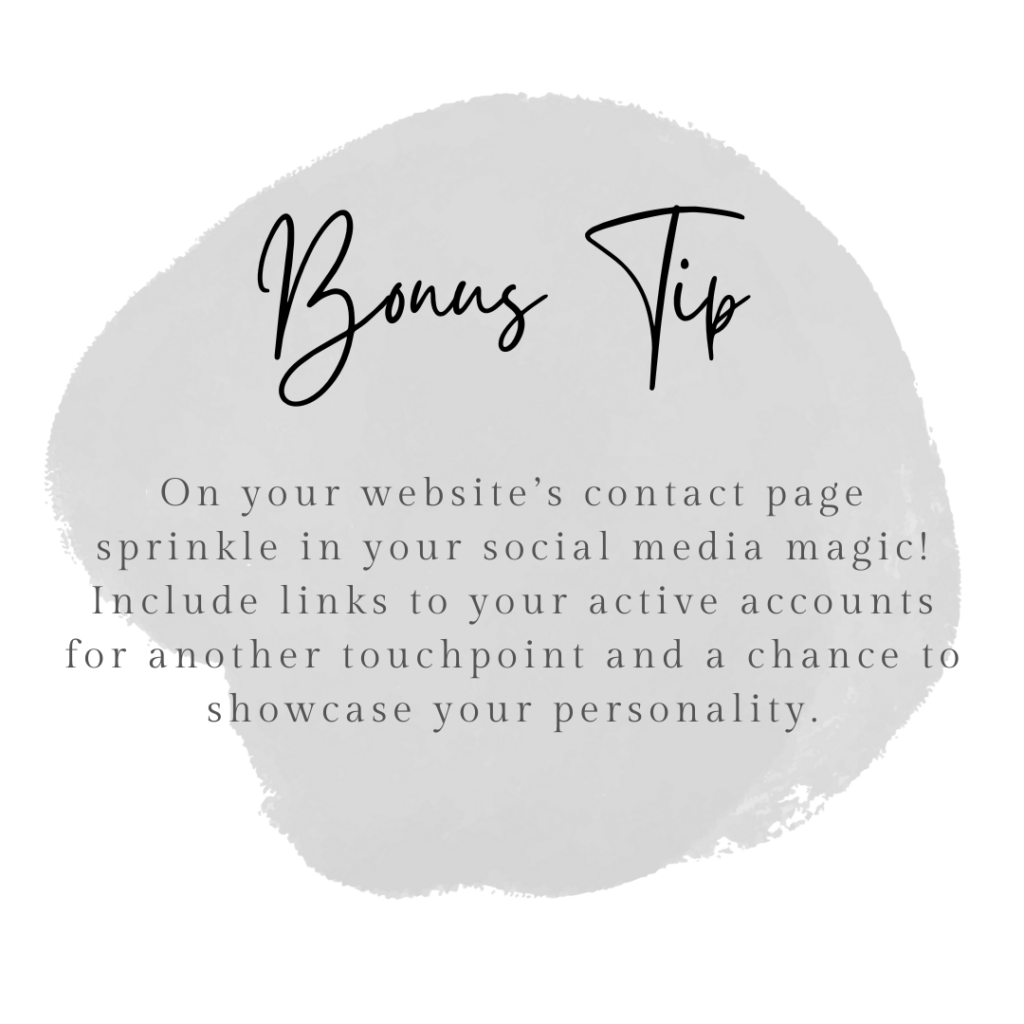
So, ditch the afterthought mentality and craft a contact page that converts. Here are 5 essential elements to get you started:

Phone Number

Obvious, but crucial. Make it tap-to-call for mobile users, building convenience and trust.

Address

Don’t be mysterious! Show your location with a clear address. This builds trust and helps visitors find you, if applicable.

Map

Visual is key! Embed a map (like Google Maps) so visitors can easily plan their route. Bonus points for local businesses!

Contact Form

A must-have! Let visitors send messages and questions directly. It reassures them their inquiries are reaching the right place.

Knowledgebase/FAQs

Empower visitors with self-service! Link to resources that answer common questions, reducing support costs and offering instant help (even after hours!).

contactpageessentials

Remember, your contact page is a gateway to building valuable connections. By incorporating these essentials, you’ll not only inform visitors, but also earn their trust and convert them into customers.

Ready to give your contact page a makeover? Start implementing these tips and watch your conversions soar!

You May Also Like.

Got subscribers but no idea what to send them? A simple 3-email welcome sequence is all it takes to turn new signups into real connections. No funnels, no overwhelm. Just three emails with clear jobs, sent on Day 0, Day 2, and Day 4, that deliver your freebie, share value, and set expectations.
Your DIY brand isn't struggling because of bad taste - it's struggling because no one gave you a clear system. This post breaks it down into three things: a solid color palette, intentional font pairing, and visual consistency across your platforms. No design degree required.
Stuck staring at a blank email every week? Here are five simple formats you can rotate forever, real examples you can copy, and a batching plan so you can write and send in about 15 minutes. No overthinking. No skipped weeks. Just a system that actually works for solopreneurs who'd rather run their business than agonize over newsletters.

Your First 3 Emails, Already Mapped Out.

The Welcome Sequence Starter Kit is a plug-and-play framework with prompts, subject lines, and send timing for the 3 emails every new subscriber should get. Just fill in the blanks and hit send.

This field is required.