


You’ve likely come across the term “white space” when discussing website design. But what exactly is it, and why do designers insist on leaving all that “empty space” around your content?
White space, also known as negative space, refers to the empty areas on your website. It doesn’t have to be literally white – any color (or lack thereof) that creates space between elements counts! While it may seem counterintuitive to leave space blank, white space is a powerful design tool that serves several crucial purposes:
- Improved Readability: Just like taking a deep breath in between sentences, white space around text allows your visitors to breathe visually. This makes your content easier to read and understand, preventing overwhelm and information overload.
- Enhanced Focus: With less visual clutter, white space directs your visitors’ attention to the most important elements on your page, like call-to-action buttons or key product information.
- Clean and Modern Aesthetic: White space creates a sense of balance and harmony in your design. It evokes a feeling of sophistication and professionalism, leaving a positive impression on your visitors.
Now that you understand the benefits, let’s explore some key areas where white space shines on a website:
Call to Action Buttons
Imagine a crowded room with everyone shouting at once. You wouldn’t be able to hear anyone, right? The same applies to CTAs (calls to action). By using ample white space around your CTA buttons, you make them stand out from the background. This allows visitors to easily identify them and understand the action you want them to take.
Example: Look at how Animal Humane Society’s website uses generous white space to highlight their “DONATE” button, making it the clear focal point.

Borders and Dividers
White space can be used creatively to create subtle borders and dividers between different sections of your website. This helps organize content visually, guiding visitors through the information hierarchy.
Example: This website uses thin white space to separate blog posts without appearing cluttered.

Text Content
Line spacing and margins are crucial for readability. Ample white space between lines of text, paragraphs, and headings prevents your content from becoming a dense block that discourages reading.
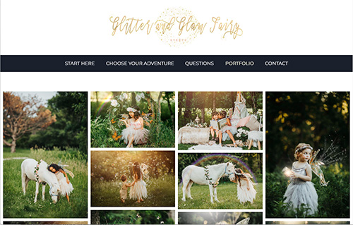
Image Galleries
White space between images allows each image to breathe and be appreciated individually.
Example: This online art gallery uses white space to showcase each artwork without visual competition.
Blog Posts
White space is essential for breaking up text in blog posts. Consider using white space around images, infographics, and videos for visual variety and easier reading.
Graphics and Illustrations
Similar to images, white space allows complex graphics and illustrations to stand out and communicate their message effectively.
Example: This makeup artist uses white space to help the graphics that represent her services stand out more.

Animated Elements
White space can be used strategically to create a stage for animated elements. This allows the animation to take center stage and grab your visitor’s attention.
By strategically using white space, you can create a user-friendly and visually appealing website that effectively conveys your message and drives conversions. Remember, white space is your friend – use it wisely to create a website that’s both beautiful and functional!